Now that the second issue of the independent magazine I edit and design, Road Grays, has been released, I thought I’d write a bit about the process behind one of my favorite pieces.
Road Grays is a baseball magazine, but it focuses more on the stories behind the game than on stats or stars. In Quantified, a recurring department, I’ve been using data visualization to explore ideas that typical “stats” aren’t concerned with—because they happen off the field. (In the first issue, for example, I created a taxonomy of minor league team nicknames.)

By diving deep into something that “doesn’t matter,” I suppose we’re gently making fun of many fans’ obsession with statistics. But the fun part is that I do actually find some fascinating insights into the state of the game, simply through the act of making these visualizations. And that works by not having preconceived notions of what I’m going to find.
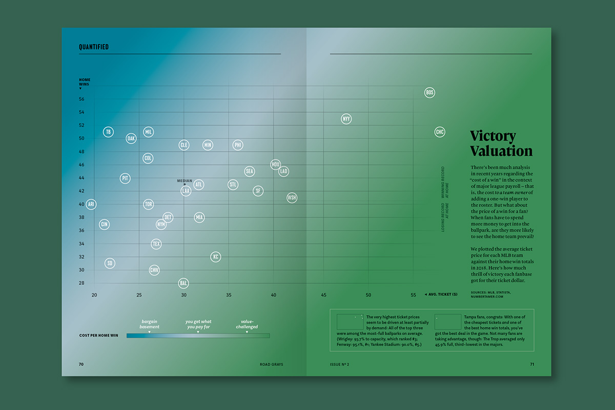
For the current issue’s piece, I had a general idea that “value” would be an interesting thing to explore. There’s a belief in modern sports analytics that one can calculate “the cost of a win”: essentially, the money it takes to sign a hypothetical player who improves the team’s performance by one win. I thought it might be fun to turn that inside out somehow, to talk about costs and value in a different way.
First I pulled as much data as I could find, from publicly-available sources, that seemed like it could be useful: attendance, ticket prices, payroll, and wins from last season. I hoped that some combination of these might yield an interesting correlation or two, but I had no idea what that might be.
It wasn’t until I started to translate it visually that I discovered some possibilities. (The design process can be an uncoverer of meaning, not merely a conveyor of it.) There’s a great open-source online tool called Rawgraphs that’s invaluable for this: You can input sets of data, assign them to different variables (X axis, Y axis, and size or color, for example) and see the results in seconds. Then you can reassign them and see if something else interesting pops up.
What I’m looking for at this stage is: What patterns can I find that are interesting? What outliers might there be that help tell a story, too? And then, what’s the clearest way to present them?
I settled on the idea of showing ticket prices vs home wins, as a way to illustrate how likely a fan was to “get their money’s worth” when attending a game. My first big decision: Which is the X axis and which is the Y?

With a couple clicks on Rawgraphs I could compare both options, and one seemed to make the trend line more obvious. Serendipitously, it also worked better with my layout: I knew this chart would need to span a full spread, and the clearer option didn’t have any data points situated in the gutter.
Next came a number of visual design decisions. In order to help make sense of the teams’ placement on the graph, I wanted to represent how far from the “average” cost per win each team was—so at first I tried using different colors for the team names based on their distance from the trend line. But it ultimately felt more clear to put those colors in the background to create a sort of “value map,” on top of which each team’s location could be knocked out in white.

With any data visualization project, I like to find additional “layers” of information, to deepen the story being told. In this case, displaying the median values, as well as a line separating winning from losing records, add another such layer: They help create points of comparison (and underscore how some teams can have good “value” despite performing poorly and vice versa.) Secondary mini charts pull out a few interesting outliers, acting as guides to some of the insights the data provides, and they make use of some of the attendance info I’d gathered earlier. Never throw data away: You might find a place for it later!

The final piece can be found in the second issue of Road Grays.