I was recently mulling over some ideas for a future publishing project, and my mind returned to a concept that first occurred to me a few years ago — a tool for thinking through the possibilities of any editorial design project that I called the Uniqueness-Flexibility Matrix.
At the time, I was working on a big magazine redesign, and the editorial lineup was changing quite a bit at the same time. This meant we were developing a lot of brand new departments at once, which is where this concept really comes in handy — it’s a way of thinking through a whole design system, but it’s simple enough that you can work it out on the back of a napkin. Here’s how it works:
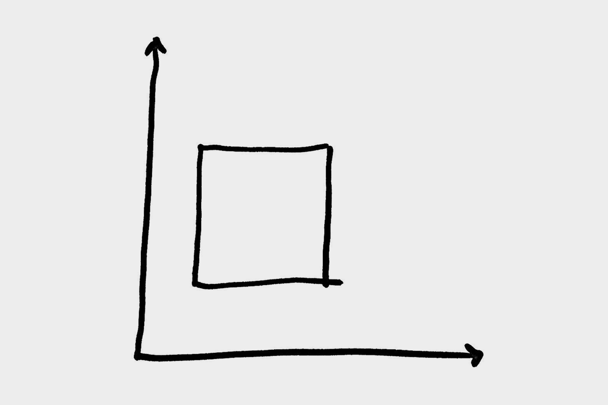
Essentially, the design for any department, section, or recurring piece in a publication can be thought to exist along two axes:
- Uniqueness within the publication
- Flexibility from issue to issue

In other words, for each recurring item you’re asking two things: How different is it from its neighbors (which, taken as a whole, helps determine how flexible the publication’s overall design system needs to be) and how much variety is it likely to have over time (which determines how flexible its own design needs to be).
Imagine something like an Editor’s Letter. You might plot that on the matrix around here:
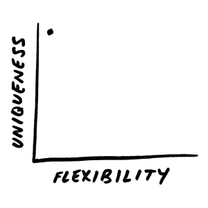
Uniqueness is high, since nothing else in the mag looks like a letter. But there’s usually no flexibility at all; letters like this are often 100% templated, down to the familiar smiling headshot.
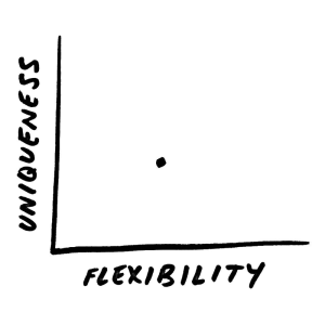
Meanwhile, something like the back page ‘dessert’ piece that many print magazines have might be here:

Again, these tend to be quite unlike anything around them, being a single page with a tight concept. But in this case we’ve charted the flexibility moderately high, indicating that it can change a bit each issue to suit the content and art for that installment. (For a different publication whose last page has a very rigid design—think New York’s Approval Matrix [no relation!]—you might put it much farther left.)
How about other department pieces? You can imagine one that’s plotted like this:
Maybe it shares quite a bit of underlying structure with other pieces of a similar kind, but there’s some moderate flexibility each time for different art treatments, different lengths, etc.
Here’s where things get interesting, because you can really change the character of a section — like a chunky front section or a series of columns — by playing with the placement of that dot on the matrix. Should readers feel a reassuring regularity as they move through the section, or are they on a wilder ride with a sense of discovery and surprise? How much can the layout flex each time while still feeling recognizable to a regular reader?
I’ve found this framework to be really helpful for thinking through a design system for a publication, but it’s a useful idea for all kinds of other projects too: The planning stages of larger web projects, for instance (when deciding whether a type of content requires a new template or page style), or even just determining how a set of deliverables fits into a larger marketing campaign that might evolve over time.
Which brings me to one other consideration with the Uniqueness-Flexibility Matrix: How far do the axes extend? You can imagine a theoretical publication with both variables at zero (the most rigid template possible, where only the content ever changes) and one with both variables at infinity (each new article is a world unto itself with no similarities to any other, past or present).
Somewhere on that infinite matrix is a smaller region that represents the design space for any given project. How big should that region be? Said another way: How far in should you trim your possibilities?

As an editorial designer with a foot in both print and digital worlds, I find it curious how many of our digital reading experiences are still squashed into the lower left corner of that infinite matrix. There are, of course, some good reasons why. But I wonder what we could gain if we start to expand outward and upward, just a little.