“What font pairs well with _____?”
It’s a question a lot of young designers grapple with, if internet message boards are any indication. And it’s one that dozens of websites are all too happy to answer, with specific suggestions that purport to take the guesswork out of all this difficult type-pairing stuff.
If only it were that easy.

The trouble is that “pairing” is the wrong way to think about what you’re doing when you’re choosing type. When you’re pairing, you’re focused on how your font choices relate to each other, rather than how they relate to the jobs you’re asking them to do. You’re acting as a matchmaker, when you should really be something more like a casting director.
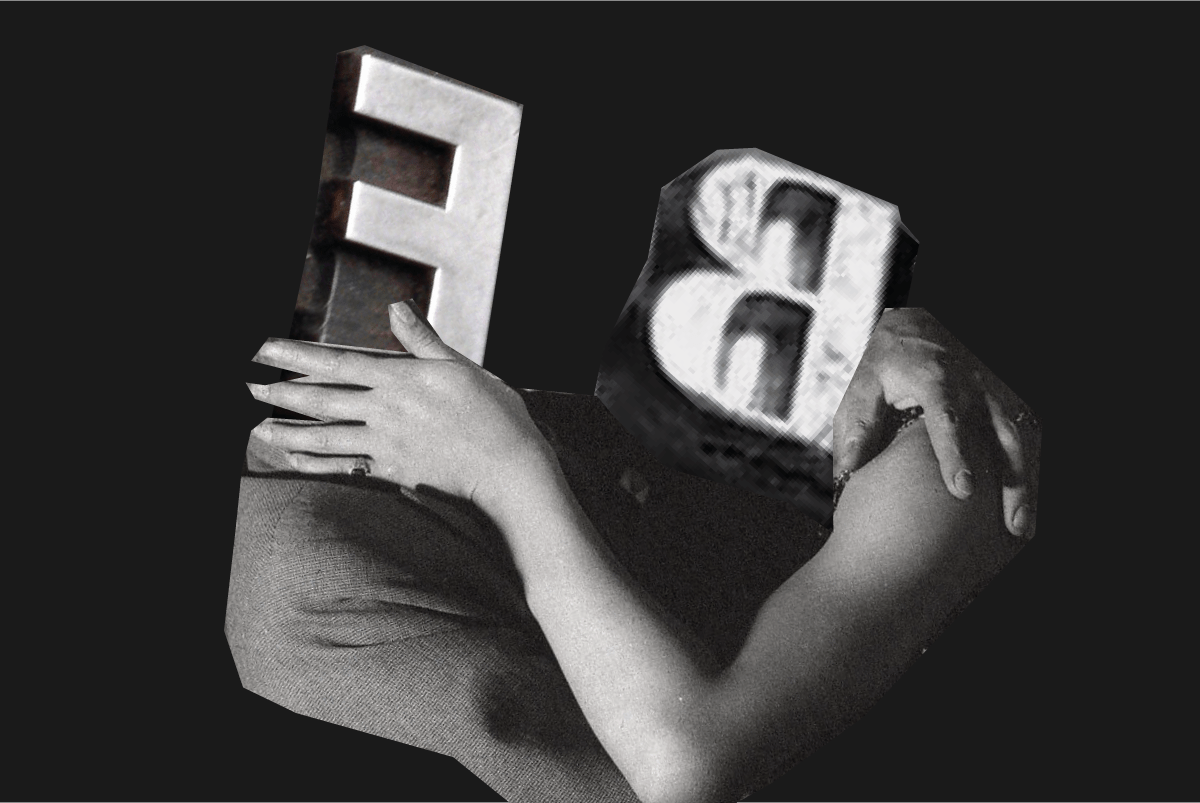
An illustration of what I mean: I remember learning about pairing in college through the example of Futura & Bodoni, which despite superficial differences share certain skeletal characteristics: rational, upright, and more influenced by geometric construction than by handwriting. And for certain kinds of work (a poster or a book cover, say) they can be a fine team: Set a few words nice and big, play up the contrasts, and let those underlying similarities tie it all together.
But what if you’ve got a different role you need them to play? Maybe you need to set some long passages of very small text? Suddenly your expert-recommended pairing isn’t so perfect, because neither of its members can perform as you need them to. Bodoni’s thin strokes disappear at smaller sizes, unless you’ve got a version with a proper optical size (and even then, I find it fatiguing to read at length). And while some people insist that Futura is perfectly usable as 8-point body text, they are wrong.

Of course it’s good for all the type to have that ineffable sense of “feeling like it belongs together,” but that’s secondary. First you have to consider what you need the type to do in your project, and make sure you’re choosing typefaces that are suited to those roles.
In my publication design work, I often like to work “from the inside out”: I start by choosing the type that will be read most—the body text—before finding players for the supporting roles. Sturdy text faces aren’t glamorous, but if you get that first choice right, you’ve set the tone for every choice that follows.
Depending on the needs of the job, I might next add a workhorse sans-serif that plays well with the body-text choice and is flexible enough to cover multiple roles (like a character actor who can do a bit of everything). Then one or two display options, which depending on the project might be a little more assertive in personality—your scene-stealer types—and finally any specialized utility players if the design calls for them.

Notice that at no point am I limiting myself to a specific number of typefaces. Instead I’m thinking only about what roles must be filled, and then finding the right typographic candidates for them. My “pairing” might be a trio or quartet, or it could even be the members of a single font family. But no matter the size of the cast, the goal is always to build an ensemble that’s right for the job at hand, not just a pair that’s happy together.