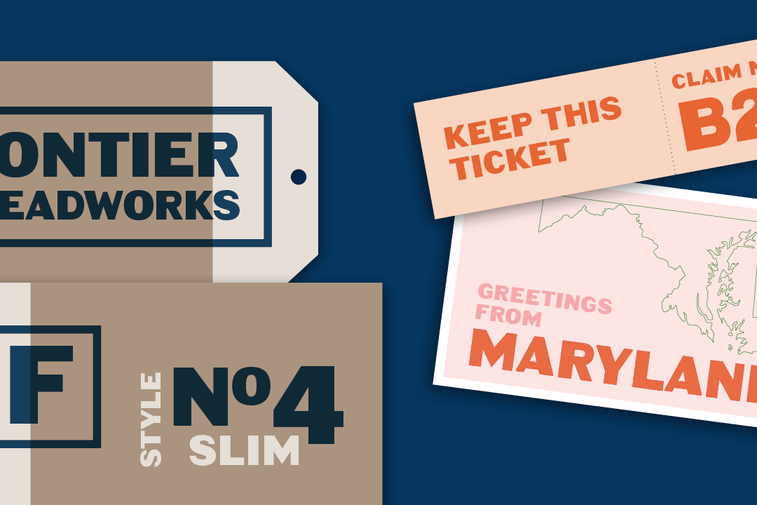
I’m pleased to announce a new font release: Bore, a bold, all-caps display typeface.
Bore was inspired by some unusual mid-20th-century fabricated signage, affixed above the entrances to the Baltimore Harbor Tunnel, near my home. (The hole that such tunnels snake through is called a “bore.”)

The signage’s letterforms—odd and wonky but pleasingly industrial—have fascinated me for many years. To my eye, they look like a hybrid of American gothic sans and art-deco-style forms, but executed by someone untutored in typography. Typographic outsider art!
A few years ago I set myself the challenge of translating these letters into something that would be useful as a digital font. It was difficult—but fun—to find the right balance: cleaned up and regularized enough to be usable and professional, but not so much that the weird character of the original would be lost.

(I kept the left- and bottom-heavy structure, the “backwards” M, and the “squinty” P and R, for instance, but most of the inconsistencies in shapes, widths, and stroke lengths were smoothed out.)
I think the finished product has a unique, quirky confidence that will lend some unusual retro vibes to all sorts of display uses. I’m looking forward to seeing how people decide to use it.
I’ve decided to release Bore for free under a Creative Commons license. You can download it here.
